January is an ideal time to review email content that was sent for year-end giving campaigns and Giving Tuesday.
We read through all of our emails and wanted to share a few items things we liked and emails that you can learn from. In addition, we share a Giving Tuesday-related social media campaigns we liked and one that was annoying.
Things we liked
1) Reveal/ The Center for Investigative Reporting’s Facebook Live on Giving Tuesday
Facebook was increasingly important for many nonprofits this year as the addition of a donation button made it easier for your Facebook followers to get engaged.
Reveal did a two hour Facebook Live session in which they answered questions from their followers and explained how they use donations in their every-day work. This session was an innovative way to connect with users. It allowed Reveal to share their story directly with supporters and make it easier to solicit donations through Facebook.
2) National Domestic Violence Hotline’s follow-up solicitation email copy
One of the organizational challenges during giving days is that it is difficult to update your email list fast enough to remove individuals who have given earlier in the day.
National Domestic Violence Hotline included this sentence at the beginning of their follow-up solicitation email:
“If you haven’t yet made your gift to the National Domestic Violence Hotline this #GivingTuesday, you have a few hours left.”
This sentence does a great job of giving your organization an out for sending a solicitation email to someone who gave that day. By utilizing the language, “If you haven’t yet made your gift” you minimize the chance that a donor will be confused on why you’re asking again.
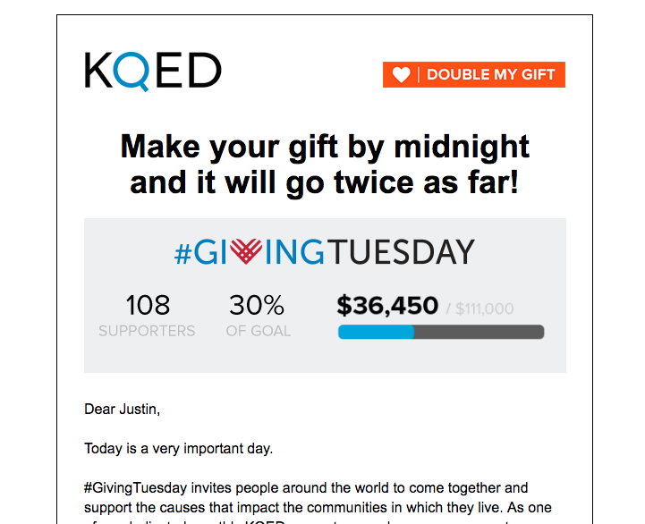
3) KQED’s Giving Tuesday Image
In one of KQED’s email messages, they use a text and graph image in the header that illustrates where they are on their goal.
They made this a clickable link so that individuals who click on the information will go directly to their donate page. All of the pieces of the graphic combined well for the alchemy that is fundraising email communication.

- The “Double my Gift” button in the top right corner is a bright color and pops in comparison to the rest of the email. It also reminds individuals that their donations will be matched which increases the likelihood of a contribution for some donors.
- The listing of 108 supporters reinforces that other people support KQED. There is a small subset of people who want to know the causes that are important to them are also being supported by others. Adding this number appeals to those potential donors.
- Meanwhile showing the exact percentage and amount illustrate to some donors that their donation can have a significant impact and is needed for the organization to reach their goal.
- The fact that amount that has already been donated is a precise number also makes the email communication more authentic. If the image said 150 donors and $60,000 exactly, most readers would think that the numbers were made up, even if that was what the exact amount was at that time.
4) She Should Run’s links to donate page
As you’ll see in the areas that can be improved, it is best to provide a few access points to the donate page. This year-end email from She Should Run shows how this is done successfully.
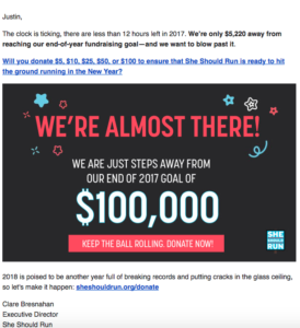
There are three links:
1) Text that is underlined like a link
2) An image that you can click on
3) An easy URL that is written out
When adding donation links in your emails, you want to cast as wide a net as possible for donors. Some readers will not realize that you can click on an image or don’t trust URLs that are hyperlinked. They want to the URL for where they’re going. This email provides three options that will appeal to all levels of readers.
Things that could be improved
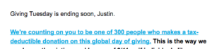
1) “Giving Tuesday is ending soon, Justin.”
An organization based on the East Coast sent an email declaring that Giving Tuesday was ending soon. This email landed in my inbox at 12:43 pm. Nonprofits often have challenges with the timing of communication. If you don’t know the time zone of your recipient, it is difficult to make this type of language accurate for all donors. It’s best to skip specific time references and find a way to build a sense of urgency in another way.
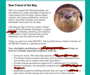
2) Burying your donate button
The image below doesn’t capture the full extent of this issue. The email continues after this section with a few more paragraphs before it gets to a link to donate. By burying the donate button at the bottom of the email, you’re assuming that your reader is going to scroll all the way through the message. Don’t make that assumption. It’s best to include a donate link at the top of the fold of your email and near the bottom of the email. This provides an easy way for your readers to immediately donate. Additionally, by including a second link at the bottom of the email, you’re able to give an easy access point to donors who have read the entire email message. This ensures that they don’t have to scroll back up the email to click on a donate button. While these are very minor adjustments, they are essential, especially for those that are reading the email on a mobile device.
3) No Text Link
This example is the flip side of what we highlighted for She Should Run. In addition to providing a link to donate at the top of your email, it’s important to include a link to your donate page somewhere in your text. This link helps a small portion of your email audience – people who aren’t good at email.
The email below doesn’t include anywhere in the text that is colored blue and underlined. While it may seem evident to nonprofit professionals or people that regularly donate that you’re supposed to click on the “MAKE A LIFE-CHANGING DONATION” button, there is a group of readers who don’t know that is a clickable link.
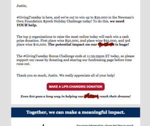
If the organization had included a link to the donate page in the text “support our cause by donating” they would likely have seen a small increase in online donations.
4) Dear ,
We’ve addressed this in the past, but if you’re not sure of a reader’s first name, don’t include the first name in the email. What this communicates is “I don’t know who you are, but I want your money.”
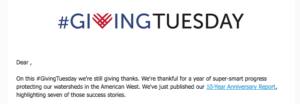
An easy fix for this is to sort your email list by “first name.” Include the customized first name field for those that are known. It helps personalize the communication. For those that don’t have a first name listed, create a duplicate email and segment it without a salutation.
5) 12 emails in 48 hours
Note: It’s going to be too challenging to hide who the sender is for this example. Apologies to Sierra Club.
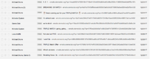
Social Change Consulting is on the conservative side of email quantity over giving days. Most of the organizations we work with are small to mid-sized. We work hard to balance the need for email communication and the knowledge that an increase in opt-out rates can have an adverse long-term effect on our clients.
Frequency overload is less of a concern for the large organizations with huge email lists. They can send multiple emails because their data will show that sending a third Giving Tuesday message will net enough money that it’s worth the increase in opts out. With that said, sending 12 emails over 48 hours is too much. And I opted out of their email because of it.
6) A reminder that what you post on Facebook is seen by your followers
Note: Again, it’s going to be too challenging to hide who this organization is. Apologies to the American Cancer Society.
The day before Giving Tuesday, the American Cancer Society posted a note on all of the Facebook fundraising pages for their organization that read, “Thank you so much for fundraising on our behalf! If you don’t already know, tomorrow is #GivingTuesday. Bill & Melinda GatesFoundation will match donations made to your Facebook fundraising tomorrow …”
These messages were a great way to encourage fundraisers to amplify their work on Giving Tuesday and take advantage of the match. The challenge with this strategy is that it broke Facebook’s algorithm for those of us that followed the American Cancer Society.
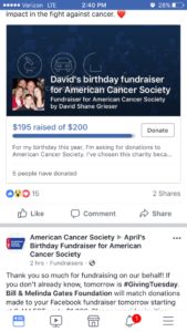
When I was looking at Facebook on my phone, there was a point in which 30 of 34 items shown in a row was ACS copying and pasting this message into different fundraisers. This caused me to unlike ACS on Facebook so that I could successfully read my feed. Again, this was a great fundraising idea; however, in practice, I suspect they saw a statistically significant decrease in fans/followers around Giving Tuesday because it messed up people’s feed.

Justin (he, him) is a Principal and Co-Founder of Social Change Consulting. He has over fifteen years of nonprofit experience, with expertise in online fundraising, digital communications, and data management. Justin helps organizations connect their communication strategy to their income development needs. When he’s not on the clock, Justin is exploring Berlin, running, listening to too many podcasts, and drinking too much coffee.