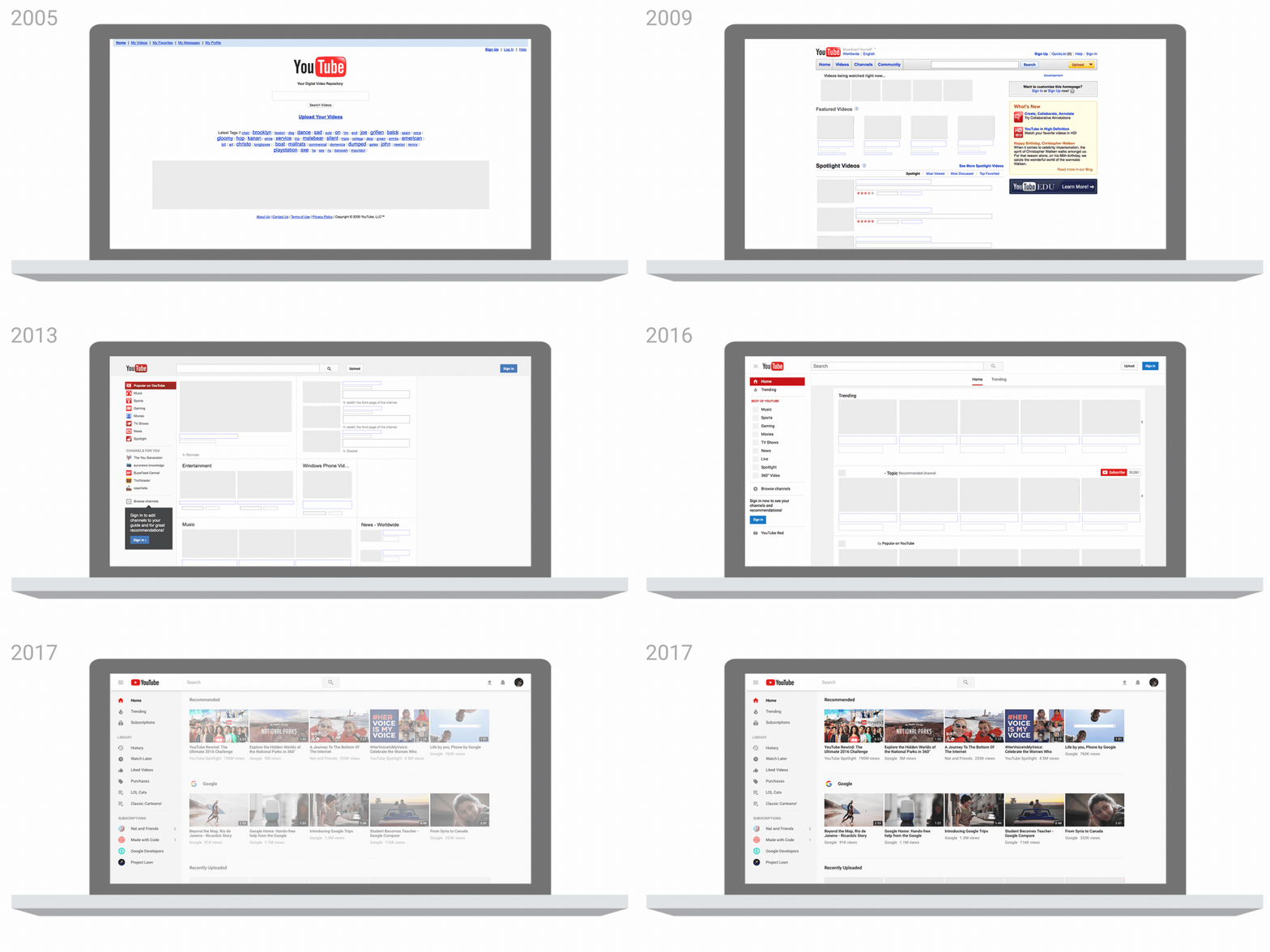
In late August YouTube made a significant update to their user interface. Click here to read their blog post about the changes.
The majority of changes are to the design of the desktop, mobile page, and logo. There are a few ways that nonprofit organizations can utilize this redesign and upcoming changes to use YouTube more effectively.
Create Playlists
As part of this announcement, YouTube shared that they are working on an enhancement to the mobile app that will allow users to jump between videos with a swipe. Creating more playlists will help you engage viewers in your content and make it easier for them to move from one video to the next. If you have any common themes in your video uploads, start preparing playlists now.
Change Your YouTube Icon
YouTube changed their social media icon as part of their logo redesign. The next time you update your website you can edit your social media icons for YouTube. This link provides many helpful brand resources.
Six-second advertisements
If your nonprofit organization is trying to reach more people, take advantage of YouTube’s testing of six-second ads.
Business Insider shares, “Advertisers have been able to effectively communicate their messages in six-second ads. YouTube found that 90% of advertisers saw a lift in ad recall after it tested 300 mobile bumper campaigns.”
You won’t be able to say much about your organization in just second seconds, but using a few key visual images can be enough to entice individuals to learn more about your work.
GIF IMage Credit: YouTube’s Official Blog.

Justin (he, him) is a Principal and Co-Founder of Social Change Consulting. He has over fifteen years of nonprofit experience, with expertise in online fundraising, digital communications, and data management. Justin helps organizations connect their communication strategy to their income development needs. When he’s not on the clock, Justin is exploring Berlin, running, listening to too many podcasts, and drinking too much coffee.
